
UI design is all about understanding user behavior and designing interfaces that meet their needs. A critical aspect of this process is understanding how users scan content on a page. The F-shaped pattern is a valuable concept that can help designers to create more effective designs by placing important information in the most visible areas. In this comprehensive guide, we’ll explore the F-shaped pattern in UI design in more detail and examine how designers can use it to create user-friendly interfaces.
What is the F-Shaped Pattern in UI Design
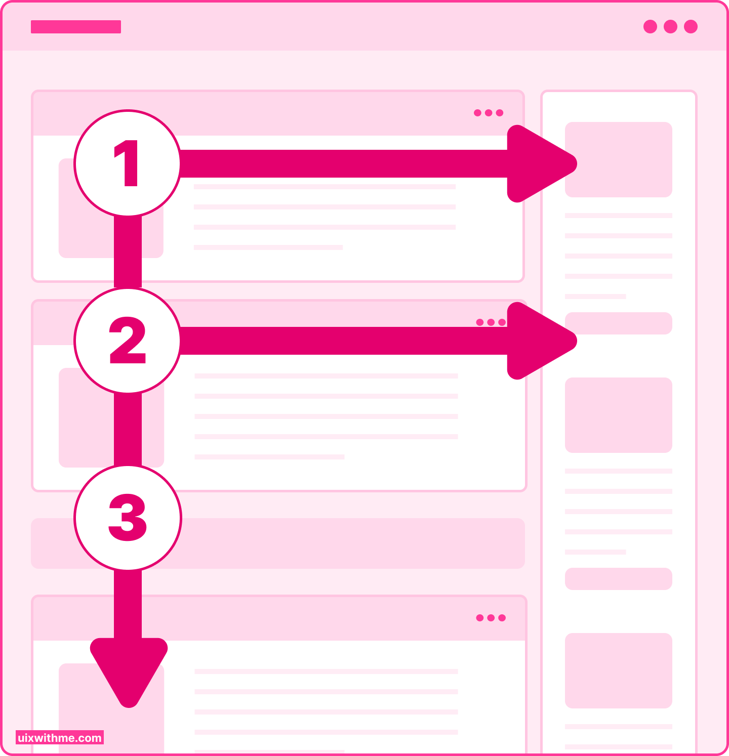
The F-shaped pattern was first identified by a study done by Nielsen Norman Group, which found that users tend to scan webpages in an F-shaped pattern. Studies have shown that users typically start by scanning horizontally across the top of the page, before then scanning down the left-hand side of the page in a vertical movement. Finally, they will scan across the page again in a horizontal movement. This creates an F-shaped pattern on the page, which is where the term comes from.
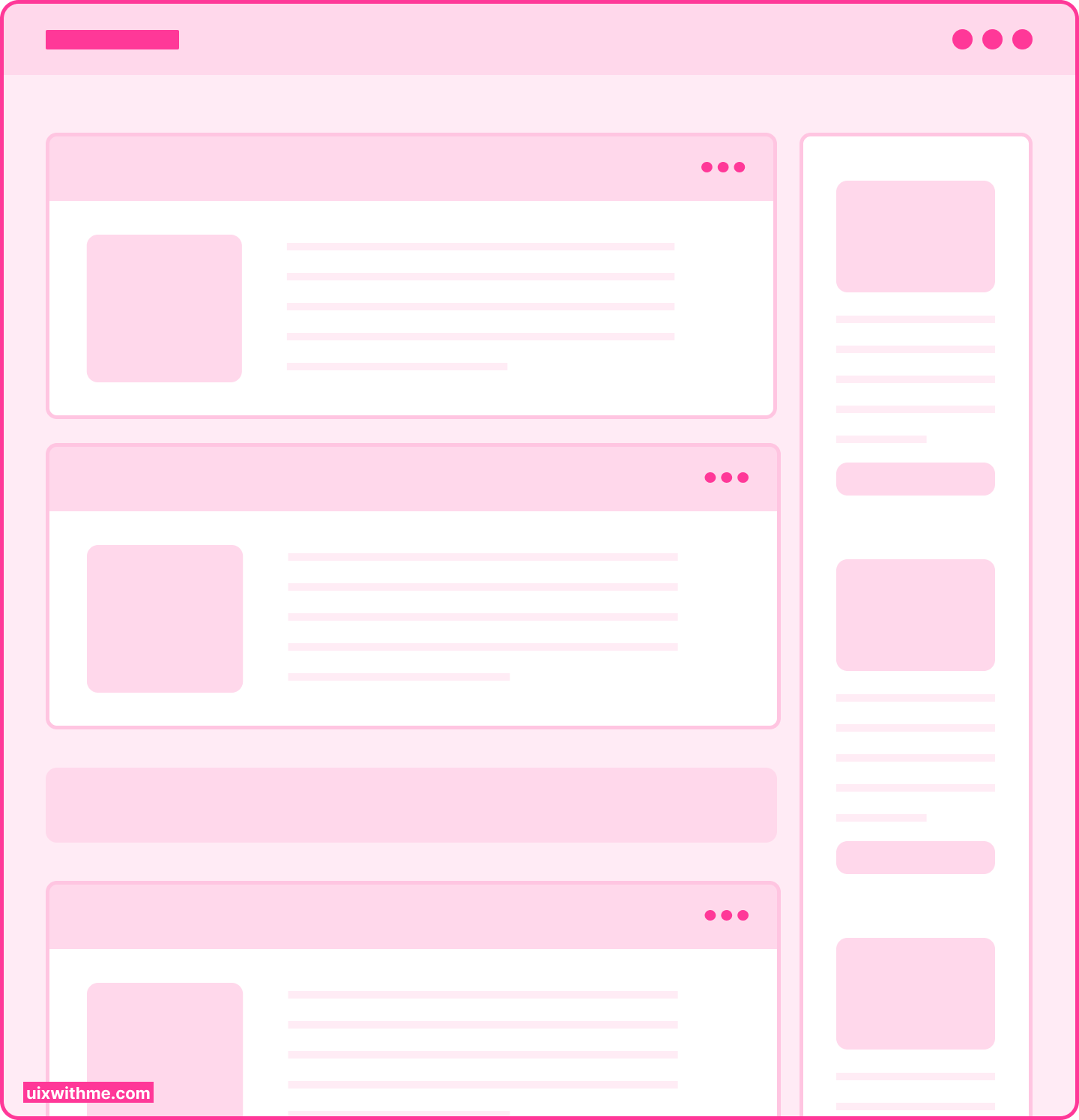
F-Shaped Pattern Wireframe
The F-shaped pattern is a natural consequence of the way in which people read. People are used to reading from left to right and from top to bottom. They are also used to scanning pages quickly, looking for information that is relevant to their needs. The F-shaped pattern reflects this natural scanning behavior, and it can help designers to create more effective designs.
The F-shaped pattern is important in UI design because it can help designers to place important elements on a webpage where they are most likely to be seen by users. For example, if you want users to click on a particular button or take a particular action, you will want to ensure that this information is positioned in the areas where the user’s eyes are likely to be looking.
Using the F-shaped pattern as a guide, designers can position important information such as headlines, subheadings, and calls to action, in the areas where they are most likely to be seen. This can help to improve the user experience and ensure that users are able to quickly and easily find the information that they are looking for.
How F-Shaped Pattern Works
Research has shown that users tend to scan webpages in an F-shaped pattern. This means that key information should be placed in the top left-hand corner of the page, where users are most likely to start scanning. The left-hand column of the page should also be used to contain important information, as this is the area where users are most likely to focus their attention. Finally, designers should place important information at the end of each line of text, as this is the area where users are most likely to pause and take in the information.
If you are a designer, there are several ways in which you can incorporate the F-shaped pattern into the design of a webpage. Here are some tips:
1- Position important information in the top left-hand corner of the page, as this is the area where users’ eyes are most likely to start scanning.
2- Keep the text short and easy to scan. Use bullet points, subheadings, and other formatting to break up the text and make it more visually appealing.
3- Use images, videos, and other multimedia elements to create a more engaging experience for users. These elements can also be used to draw the eye to important areas of the page.
4- Use
color and
typography to create a
visual hierarchy on the page. This will help to ensure that the most important information is easy to find and easy to read.
5- Test and iterate on your designs. As with any design approach, it’s essential to test your design with real users to see how well it works in practice. Use tools such as heat maps to get a better understanding of how users are
While the F-shaped pattern is a useful tool for creating web designs, it isn’t the only factor to consider. People’s behavior has grown complex, and the moves are influenced by factors such as their familiarity with the site, the task they’re trying to complete, and the density of the content on the page. Paying attention to other design elements such as navigation, accessibility, and usability will make your site more user-friendly.
Here are some examples of websites that utilize the F-Shaped pattern:
1- The New York Times: One of the most prominent news websites in the world, The New York Times, uses the F-Shaped pattern to organize its content. Headlines and subheadings are positioned at the top of the page, with longer news articles positioned below in a multi-column format.
2- CNN: CNN is another popular news website that utilizes the F-Shaped pattern. The top of the page contains images and video highlights, followed by headlines and subheadings before moving down the page to the main content.
3- Shopify: The eCommerce platform Shopify uses F-Shaped pattern to display its sales and marketing content. They have headings and subheadings at the top with product images underneath them followed by descriptions on the left and links on the right.
4- Dropbox: The file hosting service Dropbox uses the F-Shape pattern for its pricing page. Headlines are placed in the top left corner of the page, followed by subheadings and detailed pricing plans that occupy the right side of the page.
5- Apple: Apple’s homepage follows the F-Shaped pattern with top billing for their latest product launch or service followed by links to content specific to the product. They add an extra layer to the F-shape to showcase product features on the right-hand side of the page.
6- Buzzfeed: Buzzfeed is a popular website that uses F-Shaped pattern to deliver news articles and listicles in a user-friendly format. The top of the page showcases the most popular articles and trending topics, with catchy headlines and images, followed by a list of articles positioned in a multi-column format. Each article starts with an eye-catching headline in bold font, followed by a brief summary and an image placed on the left side of the column to grab the user’s attention.
By integrating the F-Shaped pattern into its layout, Buzzfeed ensures that users can easily scan through the headlines and photos to find the content that interests them. Then, they can proceed to read the full article by scanning through the top-left part of the page, avoiding the bottom right corner.
One of the popular sites that use the F-shaped pattern is LinkedIn. LinkedIn is a professional networking platform that uses F-Shaped pattern to make it easier for users to navigate through its features and functionality.
When users first land on the LinkedIn homepage, they can see a clear hierarchy of design elements. In this case, the top navigation bar serves as the introductory element or the starting point for navigation. By presenting a large number of options, users can choose the action they want to take or area they want to explore on the platform.
The central multi-column layout of the LinkedIn homepage displays content such as trending articles, job postings, and updates from their network connections. The most crucial information such as the user’s photo, job title, and location, all occupies the top left corner of the page, as it is most important to a user visiting their own profile or that of other users.
The content in each column is presented in a format similar to an F-shaped pattern with important information positioned at the top of the page with relatively small amounts of text within the layout.
The F-Shaped pattern, integrated into LinkedIn’s design, ensures that the user can quickly and efficiently find the information and sections relevant to their needs. It also makes it easier for users to navigate and access LinkedIn’s most critical features, such as the job search, messaging, or profile editing sections.
Conclusion
The F-shaped pattern is a valuable tool for designers to consider when creating user-friendly webpages. By understanding the way users scan content and design for it, designers can create effective designs that make it easy for users to navigate and find the information they need. While the F-shaped pattern isn’t an all-encompassing solution, it’s a valuable tool for designers who are looking to create effective and efficient designs that enhance user experience.
Learn UI/UX Design Free
درباره این سایت